
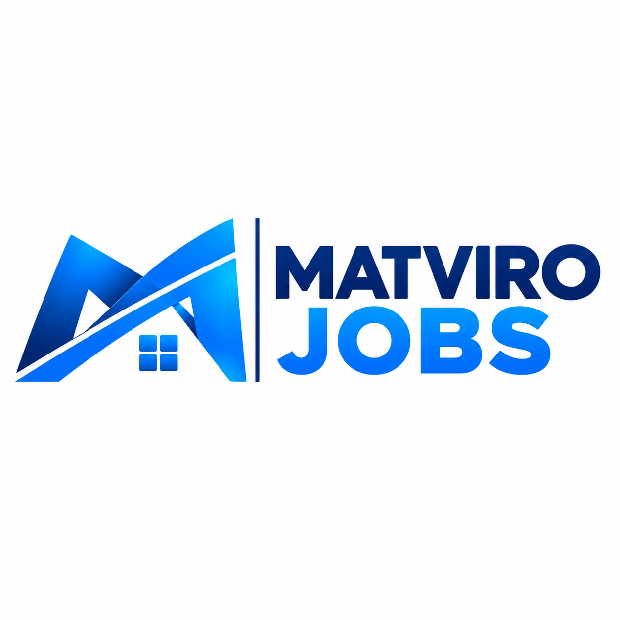
Logo Design Story
The Matviro Jobs logo was designed to represent opportunity, ambition and the connection between people and employment. As a modern recruitment platform offering both a website and mobile application, the identity needed to reflect a forward- thinking brand while remaining professional, approachable and easy to recognise.
At the centre of the design is a distinctive geometric symbol formed from bold, angular shapes. Its structure creates a sense of movement and forward progression, reflecting the journey people take when looking for new career opportunities. The smaller four-panel detail adds another layer to the design, representing connection, structure and the different opportunities that the platform brings together.
The colour palette combines deep navy blue with vibrant shades of electric blue. The darker tones communicate trust, reliability and professionalism, while the brighter blue introduces energy, confidence and a modern digital feel. Together, the colours create a strong contrast that helps Matviro Jobs stand out while maintaining a consistent professional identity.
The typography was designed to complement the symbol, using bold, uppercase lettering to create a confident and memorable wordmark. The separation between MATVIRO and JOBS gives each part of the name its own visual presence, while the vertical dividing line brings balance and structure to the overall composition.
Particular attention was given to versatility, ensuring the identity works effectively across the Matviro Jobs website, mobile application, social media and wider marketing materials. Its bold shapes and clear typography allow the logo to remain recognisable across different screen sizes and digital environments.
The finished identity gives Matviro Jobs a distinctive professional presence, reflecting its ambition to make recruitment more accessible and connect employers with the right candidates. More than just a logo, it represents a platform built around bringing people and opportunities together.