
Logo Design Story
The logo for Smart Auction UK was created to represent the company’s innovative approach to property auctions while communicating trust, professionalism and efficiency. Specialising in helping people buy and sell properties quickly and securely, the identity needed to balance the heritage of traditional auctions with the modern solutions that define the brand today.
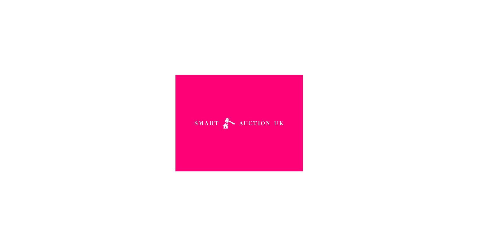
The design combines two instantly recognisable symbols: a house, representing the property market, and a gavel, the universal icon of auctions and successful transactions. By layering the gavel over the house, the emblem creates a clear visual narrative that immediately communicates the company’s core service.
One of the most distinctive aspects of the identity is its pink colour palette. Moving away from the conventional blues and greys often associated with the property industry, the bold use of pink gives Smart Auction UK a contemporary and approachable personality. The colour reflects confidence and innovation, helping the brand stand out in a highly competitive market.
The logo embodies the values that sit at the heart of Smart Auction UK: making property transactions easy, secure and stress-free. It reflects a business built on expertise and trust, while embracing a fresh perspective on how property auctions should work. According to the company’s mission, Smart Auction UK aims to revolutionise the buying and selling process through a clear and transparent approach that is “easy, free and fast.”