
Logo Design Story
The identity for Beirut Restaurant was designed to celebrate the richness of Lebanese culture while creating a strong, flexible brand system capable of supporting multiple dining experiences under one unified identity.
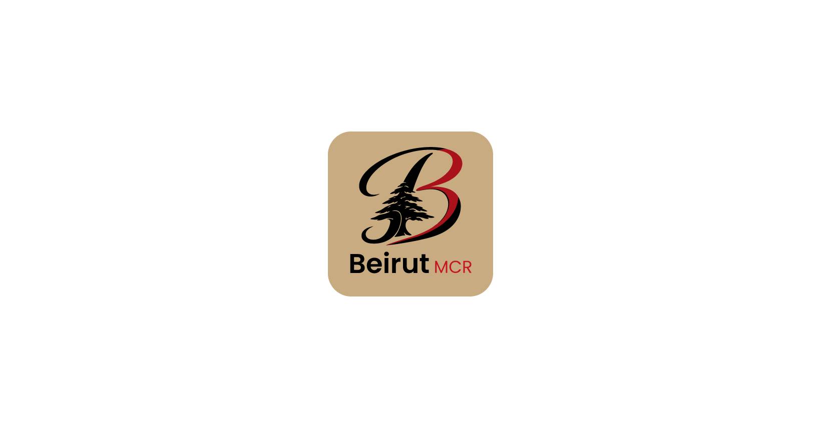
At the centre of the logo is a custom “B” monogram, carefully crafted to form a bold and memorable symbol. Embedded within the letter is the iconic Cedar Tree from the Lebanese flag, one of Lebanon’s most recognisable national symbols. The cedar represents strength, resilience, heritage and pride, allowing the brand to honour its roots while establishing an immediate visual connection to authentic Lebanese cuisine.
The concept was built around creating a parent brand identity that could unify multiple customer experiences:
- Beirut Restaurant is the full-service dining experience, centred around hospitality, tradition and the communal nature of Lebanese food.
- Beirut Spicy is the takeaway-focused concept, designed for speed, convenience and the bold energy of Lebanese street food culture.
The original Beirut Restaurant monogram remains the core brand mark, ensuring consistency and recognition across both experiences. However, Beirut Spicy also has its own dedicated logo variation, adapted specifically for its takeaway offering while maintaining clear visual alignment with the parent brand. This system allows both brands to operate independently in tone and application, while still feeling intrinsically connected through shared identity and design language.
The overall aesthetic balances tradition with modernity. The cedar tree introduces cultural depth and storytelling, while the refined execution of the “B” ensures a contemporary, versatile identity that works seamlessly across signage, packaging, menus, uniforms, social media and digital platforms.